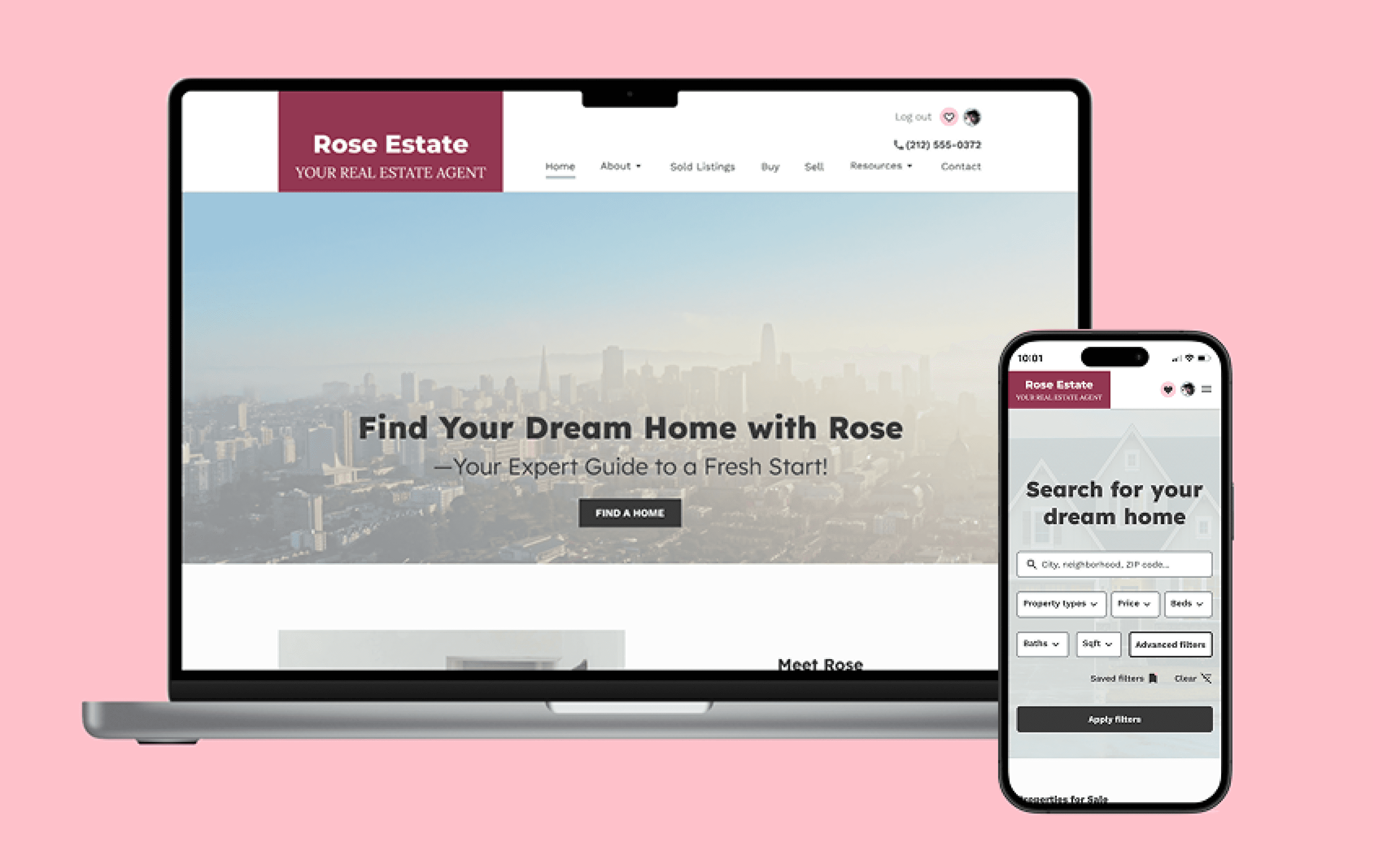
OutdoorsConnect
An end-to-end mobile application that connects like-minded individuals through a shared passion for outdoor experiences.
UX Research | UI/UX Design | Usability Testing | Delivery
View the Current Design
UX Process
01: Project Overview
GOAL & VISION
This project envisions a user-centered mobile app that connects people through a shared passion for outdoor and sports activities. The concept aims to help users discover or create events, find activity partners, and build local communities of enthusiasts.
Particularly relevant for newcomers, expats, and travelers, the app aspires to support fitness goals, encourage regular exercise, and foster meaningful social connections in a safe, inclusive environment.
client:
Self-Initiated
Role:
Solo UX / UI Designer – Research, Design, Testing, Delivery
Tools:
Figma, FigJam, Google Forms, Otter.ai, Zoom, Microsoft Office (Excel, Word)
Timeline:
8 weeks
02: UX Research
Objectives
The research phase will explore whether there is a genuine need for such a platform, uncover user behaviors, and validate the potential value it could bring to the target audience.
Type of Research:
Competitor Analysis, Survey, User Interviews
Methodologies:
Affinity Mapping, "How Might We" Questions (HMWQ), User Personas, Customer Journey Map
Analyzing Competitors to Discover Opportunities
A review of similar apps/platforms revealed that, despite a crowded market, many lack key features such as user verification, in-app messaging, rating systems, and no-show tracking. This suggests an opportunity to create a more tailored, user-focused solution. Further validation will come from upcoming surveys and user interviews.

Click to enlarge
Gathering User Data via Survey
Goal:
To gather quantitative data to support ongoing user research. Open-ended questions were included to gain deeper insights into user needs and pain points when choosing/searching the right company for outdoor activities.
Type:
Primarily quantitative with a few open-ended questions, created in Google Forms
Participants:
12


Main findings from the surveys reveal that while most people rely on friends and family for outdoor activity companions, many struggle to align with others in terms of enthusiasm, motivation, and commitment—especially after relocating. Although connecting with like-minded individuals can significantly boost motivation and support a more active lifestyle, finding the right community remains a challenge. Existing meetup platforms are often a last resort, indicating a gap in the market for a more tailored solution. Importantly, user verification emerged as a top priority, highlighting the need for trust and safety—particularly for women, who made up 67% of survey respondents.
Organizing Interview Data Through Affinity Mapping
Goal:
Conduct user interviews to listen to users’ needs and pain points, gather qualitative data, and synthesize the findings into key themes through affinity mapping to inform design decisions.
Type:
Qualitative user research conducted remotely via Zoom, with insights clustered and analyzed through affinity mapping.
Participants:
8

Click to enlarge
User research revealed a strong need for reassurance when meeting new people through the app. A top priority is mandatory user verification to eliminate fake profiles, build trust, and provide social proof—such as ratings, reviews, and visible profiles of members and organizers. Users also expressed a need for robust search and filtering tools, easy discovery of nearby activities, and in-app messaging to connect with others. Key frustrations include no-shows, difficulty finding like-minded individuals—especially in less populated areas—and fear of joining groups with more advanced fitness levels, which can discourage participation.
Translating Core User Problems into Actionable 'How Might We' Questions
#1:
How might we ensure users feel safe when joining events by implementing a trustworthy and transparent verification system that helps them assess the credibility of organizers and participants?
#2:
How might we make joining outdoor groups feel approachable for all skill levels, so beginners and advanced participants alike feel at ease?
Empathizing with Our User Persona
The research uncovered our potential users' psychological profiles, goals, core needs, and pain points.


Visualizing the Customer Experience
At the end of the research phase, I synthesized key findings into a Customer Journey Map to visualize the user’s emotional and cognitive experience before, during, and after using the app. This mapping process enabled a deeper understanding of users’ thoughts, feelings, and pain points at each stage, fostering empathy and uncovering critical insights. It also served as a foundation for generating and prioritizing design ideas (see section Proposed Ideas), many of which became fundamental to the final solution.

Click to enlarge
03: Prioritization
Objectives
Define clear project goals and establish a prioritized feature set to focus development efforts on the most impactful solutions for users and business objectives.
Project Goals: Bridging User Needs and Business Vision
I dedicated significant effort to understanding user needs, recognizing that design’s core purpose is solving real problems. Without clear user pain points, design lacks direction. Following this, it’s crucial to step back and evaluate the product from both market and user perspectives, as aligning business and user goals is key to creating successful, valuable, and sustainable products. Additionally, factoring in technical constraints helped ensure the solutions were both practical and achievable.

Click to enlarge
MVP: Strategic Feature Prioritization
Grounded in key user and business needs, I defined a focused set of core features for the initial product release. Prioritizing these elements helped streamline early development efforts while keeping future enhancements in view—ensuring both immediate impact and long-term scalability.
Explore the Feature Set Aligned with User and Business Goals
View Feature Set
04: Information Architecture
Objectives
Define a clear and intuitive information architecture by mapping the overall structure (Sitemap) and key user interactions (User Flows), recognizing that navigation decisions directly impact the product’s overall usability and user experience.
Organizing Content with a Sitemap
To better visualize the content and structure, I created a sitemap with my own key to distinguish main pages from subpages. This helped me establish visual hierarchy and clarify the information architecture—even at the sitemap stage. I found this especially valuable, as it could also help teammates quickly understand the structure during collaboration. Prioritizing features further guided what content to include, making the transition into wireframing much more focused. Since this sitemap was an early structural proposal, it also served as a foundation for the design decisions that followed.

Click to enlarge
Defining Navigation Through User Flows
Based on the key user problems identified during the research phase, I defined three core user tasks to address the most critical pain points through design. For each task, I mapped out how users would ideally navigate the interface to achieve their goals, focusing on the primary flow while also considering alternative and error paths to ensure a smooth and resilient user experience.

Click to enlarge
05: Mid-Fidelity Wireframes & Testing
Objectives
Translate core user flows into mid-fidelity wireframes to define layout, structure, content and navigation. Testing at this stage is crucial to validate design decisions and ensure usability before moving into branding and visual design.
Exploring Navigation and Layout Through Sketching
Before moving into digital wireframing, I found it highly effective to sketch initial ideas on paper. This quick, low-fidelity approach allowed me to rapidly explore layout concepts, visualize the overall screen structure, estimate the number of screens required for key user flows, and consider potential navigation patterns early in the process.

Click to enlarge
Building the Blueprint: Mid-Fidelity Wireframes
This challenging stage focused on refining navigation and usability. By developing meaningful content and working in black and white, I prioritized structure and user flow, ensuring key design decisions were clearly addressed before adding visual styling.


Task #1: Create a Hiking Trip (Unverified User) Create a new hiking trip event. When prompted, begin the verification process.
Task #2: Joining a beginner running group.
Task #3: Post-Event Actions - After attending a recurring meetup organized by the Start to Run Prague group, you leave a review of the event.
Test Mid-fidelity Wireframes
Validating Key Flows with Mid-Fidelity Usability Testing
Type:
Moderated remote usability testing conducted via Zoom, utilizing screen sharing and Figma prototype links for interactive user sessions.
Participants:
5
Key Findings
The most frequently mentioned confusion was the placement of post-event feedback. Users expected it in a dedicated feedback or review section, not in the group chat, which they saw as a space for general conversation. They recommended adding a visible feedback section on the group detail page to improve clarity.
Users also struggled to locate their profile and suggested replacing the less-used “My Score” with a “My Profile” option in the main navigation menu.
Lastly, the group join flow introduced minor friction—users anticipated an on-screen confirmation but were instead redirected to the homepage, resulting in uncertainty about whether they had successfully joined and become members of the group.
Overall Impression
Despite these areas for refinement, the overall user sentiment was overwhelmingly positive. Participants consistently praised the app’s trust and safety features, such as organizer verification, and described the experience as emotionally rewarding and community-focused. The visual layout and gamified elements were also well received, even in this early stage of development.
All users expressed interest in using the app upon launch, and the average satisfaction score across sessions was a strong 8.9 out of 10.
06: UI Design
Objectives
Before moving into the UI Design phase, it was essential to validate the mid-fidelity prototype with real users. This step ensured that the core design decisions aligned with user expectations, revealed points of confusion, and confirmed that the overall user flow was intuitive. With those insights in place, the objective of the UI Design phase was to build on that solid foundation—translating structure into a clear, engaging, and accessible interface that reinforces usability while introducing visual identity and emotional appeal.

07: High-Fidelity Wireframes & Testing
Objectives
Adjust user flows based on feedback and translate them into high-fidelity wireframes that reflect branding, visual hierarchy, and UI details. This stage focuses on testing visual clarity, accessibility, and interaction patterns to ensure users can navigate the interface intuitively and that any usability issues are addressed before development.
Refining the Experience with High-Fidelity Wireframes
Alongside visual refinement, the focus at this stage was on aligning user flows with feedback to improve clarity and usability. Key updates included adding a review section to the Group Detail page and adjusting the post-feedback flow to redirect users there instead of the group chat. Additionally, the group join flow was clarified with a toast notification confirming membership and immediate access to the group chat, available only to members.


Second-Round Testing to Optimize the User Journey
Type:
Moderated remote usability testing conducted via Zoom, utilizing screen sharing and Figma prototype links for interactive user sessions.
Participants:
5
Key Findings
Usability testing highlighted several areas for improvement. Users were unsure if events were saved as drafts before verification, raising concerns about data loss.
Location input was unclear, with vague placeholder text and no cues on whether it was automatic or manual.
Joining a group via Search felt unintuitive; participants expected a dedicated Explore section or clearer CTA labels.
The group chat was hard to find due to its placement in a tab system, prompting suggestions for more visible access.
Additionally, the use of yellow for all toast notifications led users to interpret confirmations as warnings, highlighting the need for color and icon variations based on message type.
Lastly, users didn’t know how to return to feedback once the prompt disappeared, suggesting the need for persistent access.
Overall Impression
Overall, users had a highly positive impression of the app, describing the design as intuitive, clean, and smooth, with well-structured flows and thoughtful touches like the event creation progress bar.
Features such as group chat, user verification, and reviews fostered a stronger sense of trust and community among participants. Elements like emoji reviews, draft saving, and tagging were seen as modern and user-friendly.
Most participants expressed confidence in using the app to organize or join real-life events, with an average rating of 8.6 out of 10.
Want to dive deeper into the usability testing results and review the documented insights?
Explore Usability Insights
08: Iteration
Objectives
Refine the design by addressing usability issues and aligning the experience more closely with user expectations prior to final hand-off.
Iterating to Align with User Needs
In this phase, the focus was on addressing key usability findings alongside visual refinement. Updates included replacing the toast with a pop-up in the verification flow, UI improvements to the dashboard (e.g., subtitle for the primary button), clearer notification styles, and adding persistent access to group chat and feedback options to better meet user expectations.


Task #1: Create a Hiking Trip
(Unverified User)
Create a new hiking trip event. When prompted, begin the verification process.
Try Prototype
Task #2: Find a beginner running group
with regular meetups. Once you find a suitable group, join it and open the group chat to ask other members a question.
Try Prototype
Task #3: Post-Event Actions
After attending a recurring meetup organized by the Start to Run Prague group, you leave a review of the event.
Try Prototype
09: Conclusion
This project was inspired by my passion for outdoor activities and the challenge of finding like-minded people after relocating. While the idea came from personal experience, I prioritized user research to avoid bias and ensure the solution addressed real needs.
Initially, I was concerned about market saturation, but user interviews and competitor analysis revealed a meaningful gap. I found that focusing on a specific audience could help the product stand out.
As the vision took shape, I aligned it with both user and business goals, building a strong foundation for early testing. Feedback was key to refining the experience and identifying areas for improvement.
One of the design challenges I faced was defining the visual style. While out skating, I took photos of nature and later tried to extract a color palette from them. Since the app is centered around outdoor activities, I wanted the colors to feel natural and inviting, reflecting the environments users would experience. At first, I felt overwhelmed by the endless options. Then, as I looked out the window, I noticed a stunning sunset. In that moment, it became clear—the interface should embrace a sunset-and-earth palette to evoke warmth and trust. This experience taught me that inspiration often comes when we give ourselves space to step back and observe. The right solution doesn’t always arrive through force—it clicks when we remain open, patient, and attentive to the world around us.
A second round of usability testing brought further refinements. Users appreciated features that fostered trust and community—like strict verification, reviews, group chats, and easy ways to connect. Despite strong competition, they felt this product stood out in its genuine focus on outdoor connection.
This project sharpened my ability to design for others, adapt to feedback, and balance user and business needs. While I continue developing my UI skills, I’m proud of the progress I’ve made through ongoing research, iteration, and mentorship.
Key Takeaways
👉
User research is essential to overcome personal bias and build solutions that truly address user needs.
👉
Market saturation isn’t a blocker when you identify a specific gap or underserved audience.
👉
Focusing on a niche can help a product stand out in a competitive space.
👉
Iterative testing and feedback loops led to clear, actionable improvements throughout the process.
👉
Inspiration often emerges when we give ourselves space to observe, leading to a natural, warm color palette that aligns with the app’s outdoor focus.
👉
Trust-building features (e.g. user verification, reviews, group chats) significantly increased user comfort.
👉
Flexibility and openness to change were crucial to the project's success.
👉
Ongoing skill development matters—especially in areas like UI, which I aim to continue improving.
👉
Mentorship and collaboration played an important role in shaping the final outcome.