PSTR Studio
This project involved adding a feature to an existing product, aimed at improving the art print service by supporting customers in their print selection decisions.
UX Research | UI/UX Design | Usability Testing | Delivery
View the Current Design
UX Process
01: Project Overview
GOAL & VISION
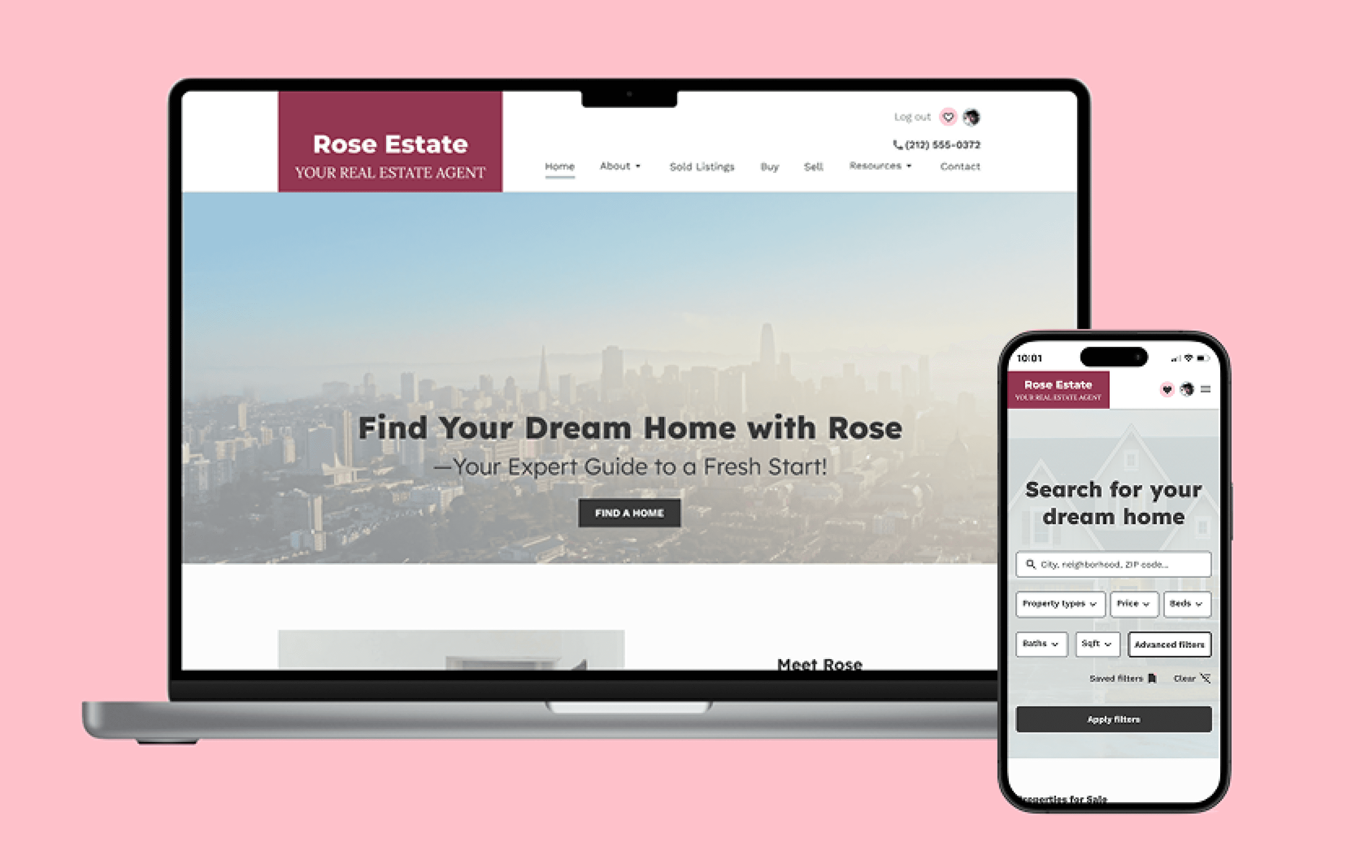
This project focused on adding a valuable feature to an existing product—PSTR Studio (www.pstrstudio.com), a Netherlands-based online platform offering a curated selection of high-quality art posters and exhibition prints. The company’s mission is to revive and share vintage artworks, making them accessible to modern homes while connecting global artistic talent with design-conscious consumers.
The objective was to enhance the customer experience by introducing a feature that supports users in making more confident and informed decisions when selecting art for their spaces. During the initial analysis, I identified a key usability gap: the absence of functionality that allows users to visualize how prints would appear in their own environment. Recognizing this opportunity, I set out to explore a solution that could address this unmet need.
client:
Self-Initiated
Role:
Solo UX / UI Designer – Research, Design, Testing, Delivery
Tools:
Figma, FigJam, Otter.ai, Zoom, Microsoft Office (Excel, Word)
Timeline:
6 weeks
02: UX Research
Objectives
To understand user pain points in selecting art prints online and define expectations for digital tools that support confident decision-making—particularly in helping users visualize artworks in their personal space.
Type of Research:
Competitor Analysis, User Interviews
Methodologies:
Affinity Mapping, Empathy Map, User Personas, "How Might We" Questions (HMWQ)
Competitor Analysis: Exploring Visualization Tools to Inform Feature Direction
To explore the opportunity of adding a missing feature to the PSTR Studio website, I began by analyzing how competitors address product visualization. Some used AR to place artworks in real environments, while others offered wall designer tool. I tested both approaches from a customer perspective. While AR (e.g., Saatchi Art) offers a modern solution, I found it less effective for smaller products like posters—especially on mobile, where scale and detail are limited. In contrast, wall designers provided better flexibility, easier interaction on desktop, and allowed users to compare and customize poster arrangements. Aware of my own preferences and initial hypotheses, I approached the next research steps with the goal of minimizing personal bias and grounding decisions in user insights.

Click to enlarge

Click to enlarge
Affinity Mapping of Interview Findings
Goal:
To understand how users visualize art at home, identify decision-making pain points, and explore expectations for visualization tools. Insights will be synthesized into themes to inform design decisions.
Type:
Qualitative user research conducted remotely via Zoom, with insights clustered and analyzed through affinity mapping.
Participants:
5

Click to enlarge
User research revealed that while some users rely on intuition and a clear personal aesthetic, most struggle to visualize how a poster will fit in their space. They expressed a need for tools to test size, framing, and view artworks in context, as well as the option to create a shortlist before making a final choice. Many also noted a lack of emotional connection when shopping online, missing the human touch and story behind the art. Additionally, users often felt overwhelmed by too many options and frustrated by unrealistic mockups that reduced their trust in the product.
Empathy Map: Understanding User Mindsets and Behaviors
The empathy map builds on the themes synthesized through affinity mapping, translating key findings from user interviews into a human-centered perspective. It captures what users say, think, feel, and do—enabling a deeper understanding of their experiences and needs.

User Archetypes: Cautious vs. Confident Art Buyers
After synthesizing user research, I created two personas to represent key user types. Lena, an uncertain customer, needs more support through visualization tools. Anouk has a strong intuition for art selection, making her decision process easier. These personas highlight how the feature can support a diverse target audience for PSTR Studio.


Turning Empathy into Opportunity: Framing ‘How Might We’ Questions
#1:
How might we help users confidently visualize posters in their own space to support informed decision-making?
(Addresses difficulty with spatial visualization, sizing, framing, and realism of mockups.)
#2:
How might we create a more emotionally engaging online art-buying experience that connects users with the story behind the artwork?
(Addresses the lack of emotional connection and human touch.)
#3:
How might we simplify the selection process to reduce overwhelm and help users curate a personalized shortlist with ease?
(Addresses decision fatigue and the need for a clearer, more manageable buying journey.)
03: Prioritization
Objectives
Define and prioritize high-impact features by aligning user needs with business goals, critically evaluating solution options, and selecting the most valuable functionalities to move beyond the MVP.
Balancing User Needs with Business Impact
By clearly defining both user needs and business objectives, I was able to envision the core functionalities the feature should address. The ultimate goal was to create mutual value—reducing purchase uncertainty to improve the customer’s decision-making experience while driving sales growth for the business.

Click to enlarge
Choosing Between AR and Wall Designer: A Comparative Exploration
User research confirmed that a visualization tool could significantly support customers in making purchase decisions when shopping for art posters online. The key question was which solution to choose. Two main options emerged: Augmented Reality (AR) and the Wall Designer tool.
AR offers an immersive experience by placing artwork directly into a user’s real environment. It works best on mobile devices with built-in cameras but faces challenges such as technical requirements, privacy concerns, and reduced effectiveness on desktops. It is also better suited for larger items, as small posters viewed on a small mobile screen provide limited value. In my own test, AR required installing a QR reader, allowed viewing only one poster at a time, and felt less practical for arranging multiple works together.
Wall Designer, in contrast, uses template-based layout customization, functioning reliably on both desktop and mobile without special hardware or privacy issues. While it lacks AR’s realism, it supports easy arrangement, scaling, and comparison of multiple artworks in a controlled environment.
Based on user needs—testing frame and size, and imagining the poster in context—Wall Designer proved more adaptable. It could address these needs directly within the browsing experience, without redirecting users to a smaller mobile interface. This made it the preferred solution for the project.
Prioritizing High-Impact Features Beyond the MVP
Working with an existing product, I began by analyzing features likely introduced as part of the MVP. I then explored additional functionalities with the potential to significantly boost both sales and brand reputation. Based on key user pain points, I brainstormed possible solutions. After evaluating how effectively each addressed user needs, I created a prioritized list and selected the features with the greatest impact for further development: the Wall Designer and Collection List.
Explore MVP and Proposed Features
View Feature Set
04: Information Architecture
Objectives
Rather than creating a new sitemap, I focused on analyzing the existing website’s customer journey to identify optimal integration points for the Wall Designer tool. With the goal of reducing purchase hesitation caused by uncertainty, I pinpointed three key moments where visualization support would have the most impact: the Collection List (included in my redesign proposal), the poster detail page, and the shopping cart. These insights directly informed the proposed user flows.
Mapping User Flows for Feature Integration
Before mapping the user flows, I first needed to define the key task flows. Three factors shaped them: the HMW questions, which captured core user needs; the decision to move forward with the Wall Designer and Collection List; and the analysis of the existing customer journey, which revealed three optimal integration points for the new feature. Once the key tasks were clear, I focused on how users would logically navigate the interface to achieve each goal. The resulting user flows reflect this approach and form the foundation for the feature design.

Click to enlarge
05: Mid-Fidelity Wireframes & Testing
Objectives
Translate the core user flows into mid-fidelity wireframes to illustrate how users would navigate the interface to access and utilize the newly proposed feature. Conduct usability testing to validate whether users can successfully locate and use the feature, and to uncover any potential usability issues early in the design process.
Low-Fidelity Wireframes: Defining Access and Interface
I began by capturing screenshots of the existing website and, using a digital drawing tablet, sketched potential access points for the new feature directly onto the current design (Figs. 1–3). While I had initially decided to proceed with the Wall Designer feature—based on a critical evaluation of its advantages over AR—the first three sketches illustrate an early exploration of the AR option. This phase represented a brief moment of reconsideration, as I reassessed which solution would more effectively address user needs and pain points.
To validate my direction, I revisited the research findings and reexamined the comparative analysis conducted earlier. This confirmed that, although AR offers an engaging experience, the Wall Designer feature is better positioned to address a broader range of user pain points identified during the research phase. The final low-fidelity wireframe presents my initial concept for the feature’s interface, outlining the key elements and layout (Fig. 4).

Fig. 1. Access point from the collection list.

Fig. 2. Access point from the poster detail page.

Fig. 3. Access point from the shopping cart.

Fig. 4. Initial concept of the Wall Designer layout.
Transitioning to Mid-Fidelity Wireframes
With the decision to integrate the Wall Designer feature and its access points logically defined, I was able to focus on brainstorming the layout, navigation, and essential elements the feature should include. Throughout this process, I kept user needs at the forefront—letting their goals guide every design decision.

Task #1: Add items to your Favorites List, then access it to use the Art Wall Designer. There, you can adjust the poster dimensions and add the final version to your shopping cart.
Task #2: Open the details for the poster Maria Murphy - Don’t Want to Go to Work. Use the Wall Designer tool to select a frame, then add the framed poster to your cart.
Task #3: Go to your shopping cart and find the Wall Designer visualization tool. Once it's open, upload a photo of your room to see how the artwork fits. You can also read the story behind the piece before confirming your order.
Test Mid-fidelity Wireframes
Validating Key Flows with Mid-Fidelity Usability Testing
Type:
Moderated remote usability testing conducted via Zoom, utilizing screen sharing and Figma prototype links for interactive user sessions.
Participants:
5
Key Findings
Usability testing revealed several opportunities for refinement. Some navigation-related issues were identified as a result of the prototype setup—specifically, combining all three task flows—which will be separated in the next iteration for clarity. Additionally, the terminology “Add All to Cart” caused minor confusion and could benefit from more intuitive wording.
A notable suggestion was to integrate a measurement tool that allows users to better relate poster dimensions to their actual space when uploading a photo. This enhancement would help users visualize artwork in accurate proportions and will be considered for future development.
Overall Impression
Overall, participants responded positively to the feature, with most finding it both useful and easy to locate—particularly the Wall Designer button on the product details page. The Favorites List was also perceived as intuitive and straightforward to use.
While the feedback highlighted minor areas for improvement, it strongly validated the feature’s value and relevance to users. The average ease-of-navigation score of 7.5 further suggests that targeted refinements could enhance the overall experience.
06: High-Fidelity Wireframes & Testing
Objectives
This stage focused on bringing the feature concept to life through high-fidelity wireframes and validating the design enhancements through usability testing with real users.
Seamless Integration: High-Fidelity Design for the New Feature
Building on user feedback, this stage focused on bringing the feature concept to life through high-fidelity wireframes. Since the visual identity was already established by the existing product, my goal was to create a visual design that seamlessly integrates with the current style.

Second-Round Usability Testing to Refine the User Journey
Type:
Moderated remote usability testing conducted via Zoom, utilizing screen sharing and Figma prototype links for interactive user sessions.
Participants:
6
Key Findings
Among the main findings, participants identified several improvements. In the Favorites List, newly added items should appear at the top, and the placement of the Wall Designer section could be adjusted for better visibility.
Refining the CTA hierarchy between the product detail page and the shopping cart would help distinguish their purposes, while adding an “eye” icon to the Wall Designer button could better convey its preview function.
Other suggestions included introducing a default room background image (e.g., with a sofa) to help users visualize poster sizes and simplifying drag-and-drop testing by limiting prototypes to one poster at a time to reduce navigation friction.
Overall Impression
Overall, participants viewed the feature as useful and helpful in supporting final purchase decisions. They appreciated its flexibility, noting that the ability to experiment with different sizes, frames, backgrounds, and poster combinations made the experience both engaging and practical.
The overall UI was generally enjoyable, though some refinements were suggested. The feature was easy to locate, with participants recommending broader access points in the future to further improve usability.
On average, the feature received a rating of 8 out of 10, reinforcing its strong potential and positive reception.
Curious how I worked with the data from usability testing?
I started by sorting the feedback into a grid of what worked, what needed fixing, questions, and ideas. Then I mapped issues by frequency and severity to set priorities for the next iteration. Want to see the full process? Hit the button below and explore.
Explore Usability Insights
07: Iteration
Objectives
Refine the design by addressing usability issues and aligning the experience more closely with user expectations prior to final hand-off.
Design Iteration: Guided by User Insights
In this step, I focused on addressing the issues identified during usability testing. Key improvements included adjusting the placement of the Wall Designer button in the Favorites List, refining the visual hierarchy of CTAs, and adding a default background with a sofa to help users visualize poster dimensions—among other enhancements.


Test the Current Design Solution
This basic prototype supports placing only one poster on the wall at a time. In the final product, users will be able to arrange multiple posters simultaneously, enabling direct comparison. This capability was one of the key reasons for choosing the Wall Designer over AR, as AR typically supports testing a single item and, even when multiple items are possible, small mobile screens make side-by-side evaluation difficult.
Task #1:
Add items to your Favorites List, then access it to use the Art Wall Designer. There, you can adjust the poster dimensions and add the final version to your shopping cart.
Try Prototype
Task #2:
Open the details for the poster Maria Murphy - Don’t Want to Go to Work. Use the Wall Designer tool to select a frame, then add the framed poster to your cart.
Try Prototype
Task #3:
Go to your shopping cart and find the Wall Designer visualization tool. Once it's open, upload a photo of your room to see how the artwork fits. You can also read the story behind the piece before confirming your order.
Try Prototype
08: Conclusion
This project involved a recurring challenge in selecting the right direction, with repeated evaluation between the Wall Designer and AR visualization tools. Throughout, I relied on research insights to guide decisions, reinforcing the core principle that effective design solutions must prioritize user needs over personal preferences.
Both Wall Designer and AR had strong merits, and during the low-fidelity stage I revisited AR as an option. However, after critically comparing each against the user pain points identified in research, Wall Designer emerged as the more comprehensive solution. These moments of uncertainty were, in fact, valuable training—helping me build flexibility as a designer and the ability to pivot when needed.
Interestingly, during the redesign process, PSTR Studio released a similar update, introducing both a collection list and an AR visualization tool. This validated my early observation that these elements were missing and confirmed the relevance of my chosen direction. It also offered an interesting point of comparison between different approaches to addressing the same user need.
While this proposal emphasizes integrating the feature in key areas to reduce purchase hesitation, I acknowledge the need for broader access points—such as from the landing page or navigation menu—in future iterations. The focus here is to demonstrate strategic placements that help retain customers during moments of uncertainty in the shopping process.
Key Takeaways
👉
Prioritizing user needs over personal preferences is essential for effective design decisions.
👉
Revisiting research findings is crucial when reconsidering design directions to ensure user-centered solutions.
👉
Flexibility and willingness to pivot are important skills for a designer when faced with competing solutions.
👉
The real-world release of a similar feature by PSTR Studio validated the relevance of the design direction and highlighted different approaches to the same user need.
👉
Strategic placement of the feature is crucial and must align with both user needs and business objectives to deliver mutual value.
👉
Future iterations should consider adding more general access points to the feature, such as from the landing page or navigation menu, to improve overall usability.